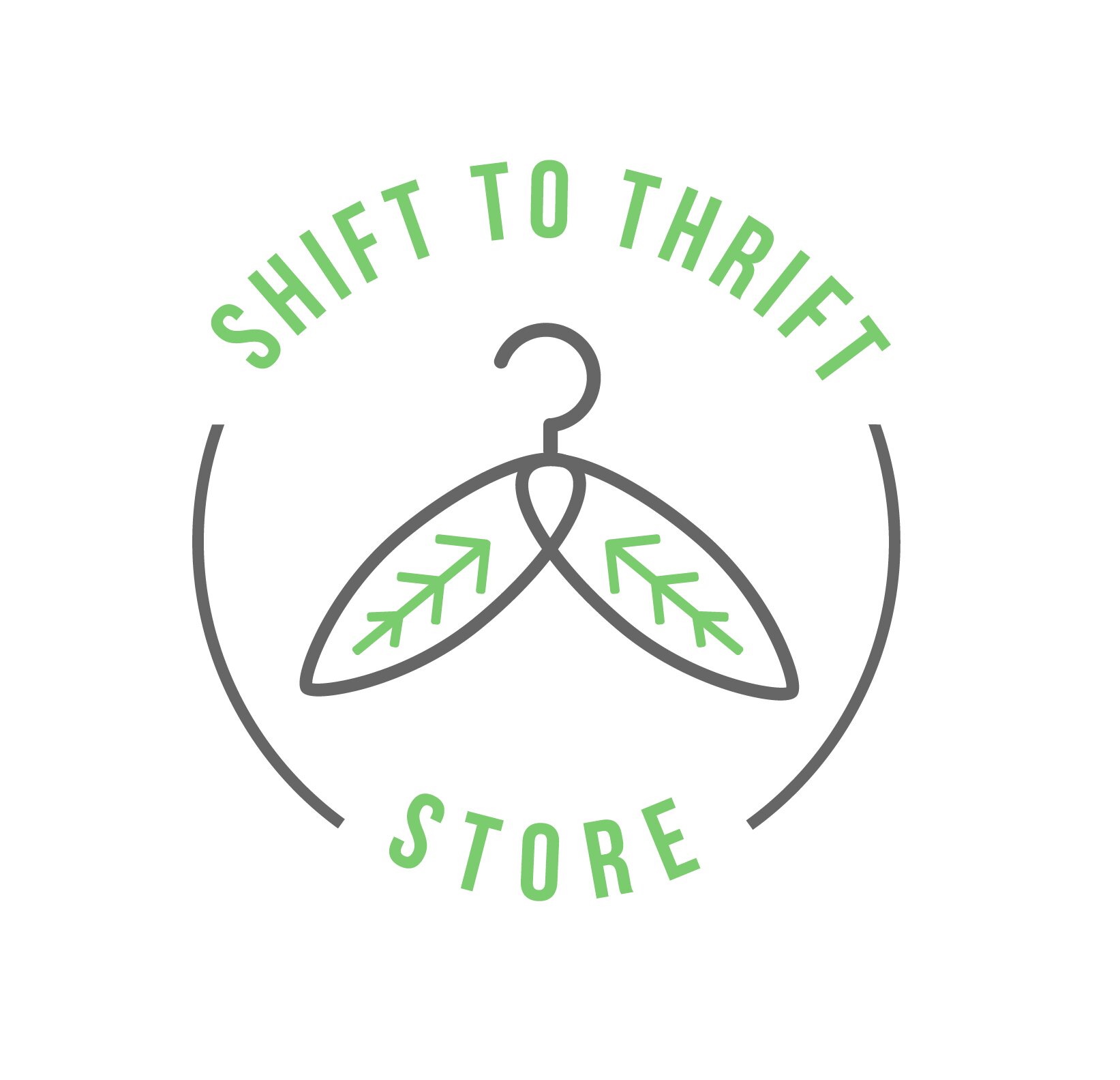
SHIFT TO THRIFT LOGO DESIGN
Task: To create a minimalist and circular logo for a thrift store brand.
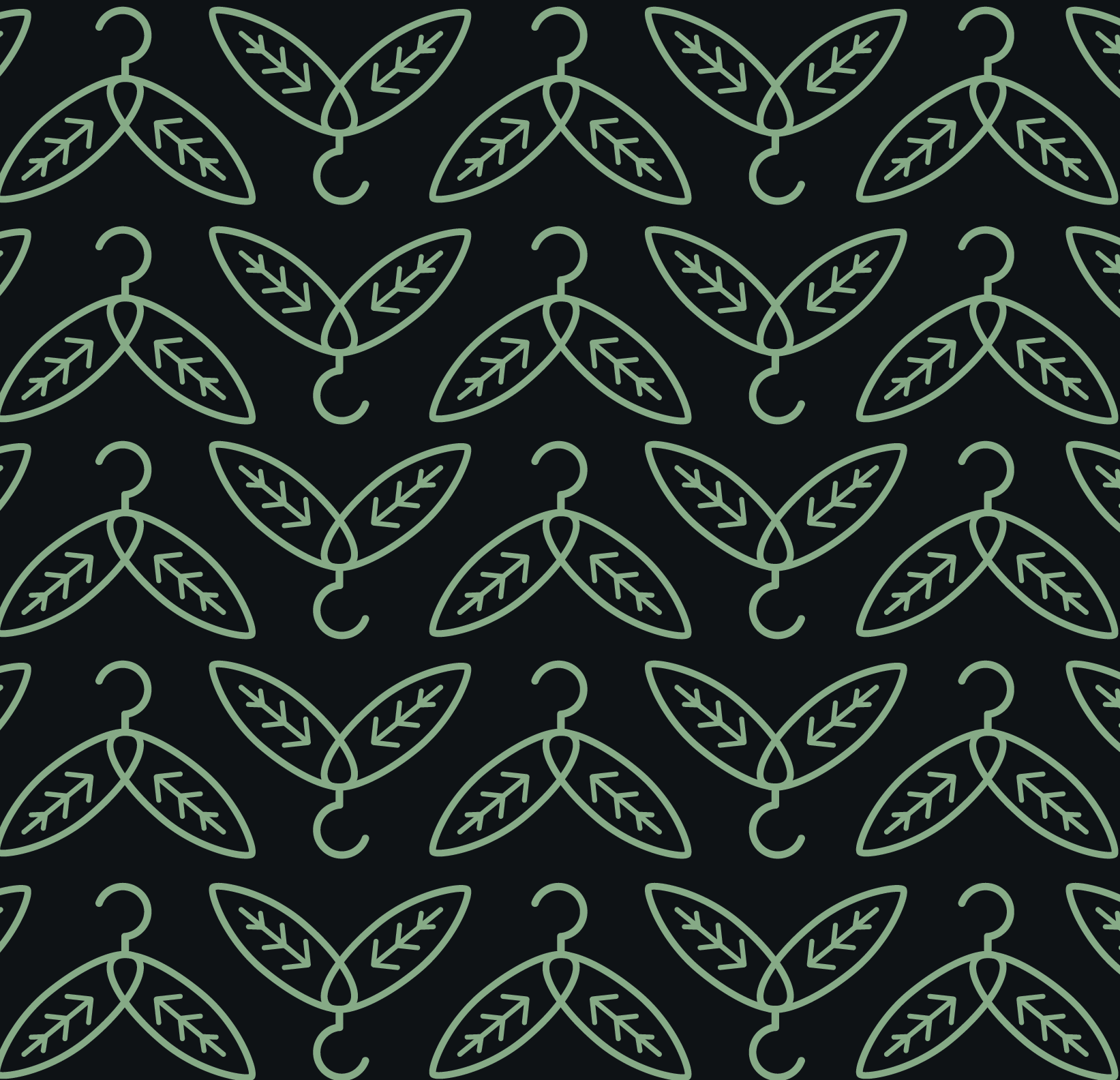
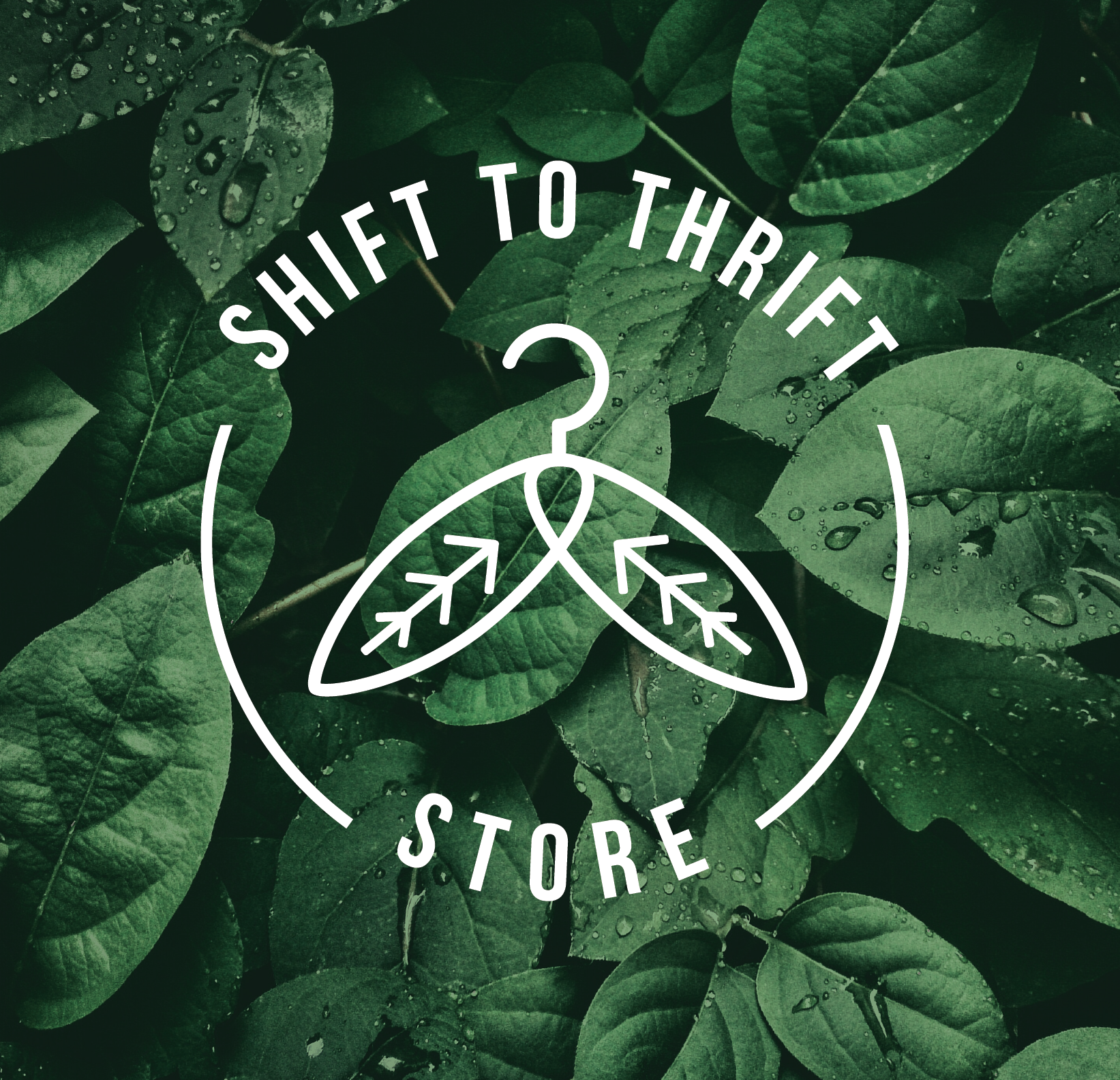
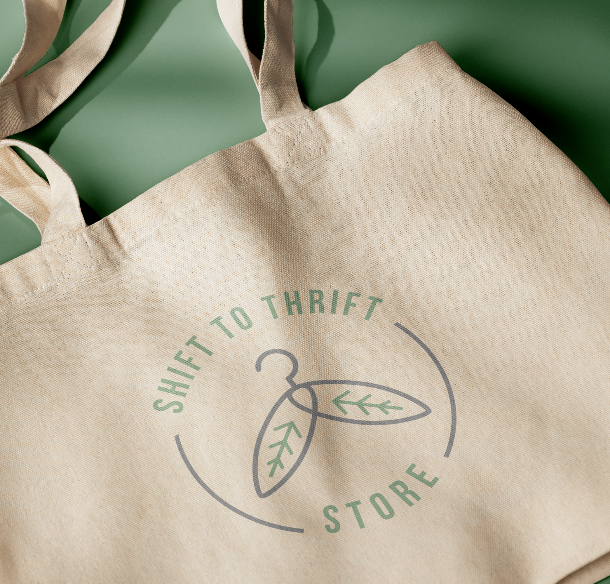
Outcome: The resulting logo mark is in the shape of a hanger with leaves in place of arms, highlighting the sustainable nature of the clothing store. The circular frame and wording around the logo mark are also indicative of the regenerative system of circular fashion, in which thrift stores play a key role. A sans serif font was used in this logo to keep it modern, clean and crisp. A primary colour palette of gray and green was chosen to communicate eco-friendliness, renewal and balance.